The Navbar
Learn what the Navbar is and how to use and design it

Yel Legaspi
Last Update 3 tahun yang lalu
The Navbar element is usually the first element on a website's page. It sits on top of the page and serves as the "compass" for your users as it helps them navigate within and around your website. It normally contains your brand and some links to the other pages on your website (or social media).
Navbar Child Elements
GoodWeb's Navbar can contain 3 types of elements inside it:
- Logo
- Navigation
- Social Links
Navbar Properties
You can modify and design the Navbar using the following properties. Remember, to access these properties, just click on the Navbar itself or the pencil icon on the floating toolbar when hovering over it.
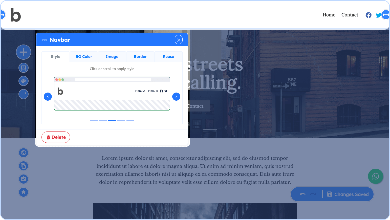
Style
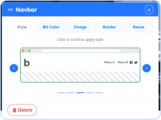
The Style property refers to how the child elements of the Navbar are arranged. To view and apply each of the styles, click on the < or > arrow on the side of the preview.
Background Color (BG Color)
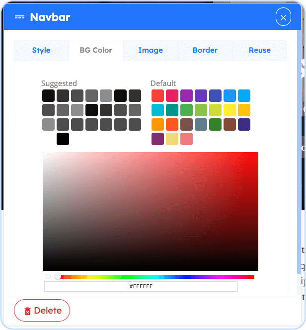
To change the background color of the whole navbar, including the background of its children, either click on any of the boxes or the palette to apply.
Background Image (Image)
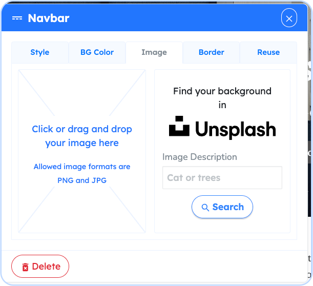
Similar to the Background Color Property, choosing or uploading a background image (either from your own computer or by searching and choosing an image in Unsplash) applies the image as a background to the whole Navbar.
Border
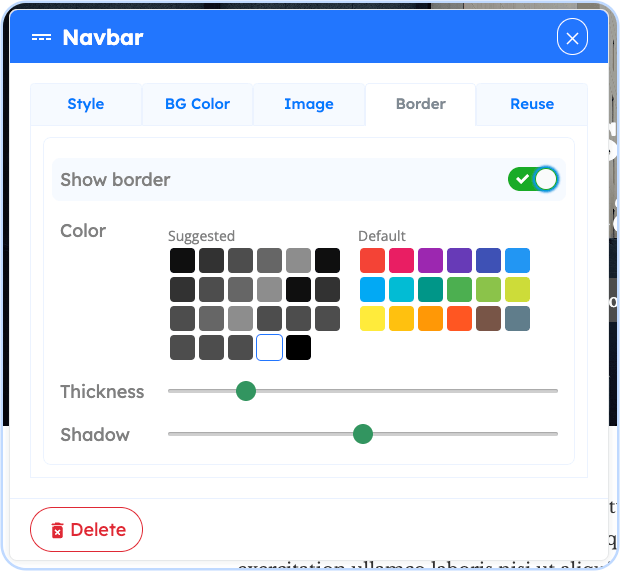
The Border Property simply adds a border to the bottom edge of the Navbar. This is sometimes used to create a demarcation line between the Navbar and the other contents on the page, specifically the element below it. To add a border, choose the color from the boxes of colors and drag the Thickness attribute and Shadow attribute to your liking.
Reuse
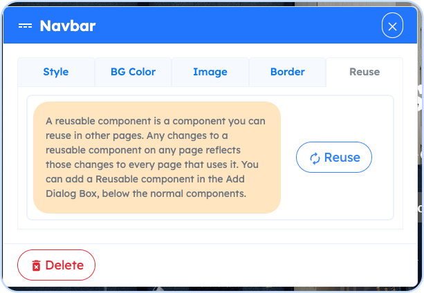
The Reuse property enables this specific Navbar to be reused on other pages and having to not redo the design and future changes you apply to it.