The Cards Section
Learn what the Cards Section is and how to use and design it

Yel Legaspi
Last Update 3 jaar geleden
The Cards Section is widely used to display a set of items in an orderly fashion. These can be your range of services, a set of products, or any itemized list. The Cards Section can contain 1 to many cards.
Cards Section Children
The Cards Section can contain 3 types of elements inside it:
- Heading
- Lead
- Cards
If you are looking to add an individual "Card", check the Cards element.
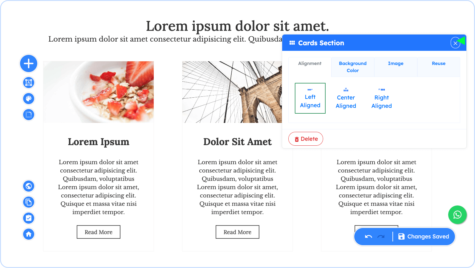
Cards Section Properties
You can modify and design the Cards Section using the following properties. Remember, to access these properties, just click on the Cards Section itself or the pencil icon on the floating toolbar when hovering over it.
Alignment
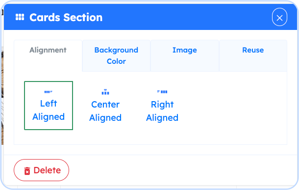
To align the children elements of the Cards section, choose between Left, Center and Right alignments
Background Color
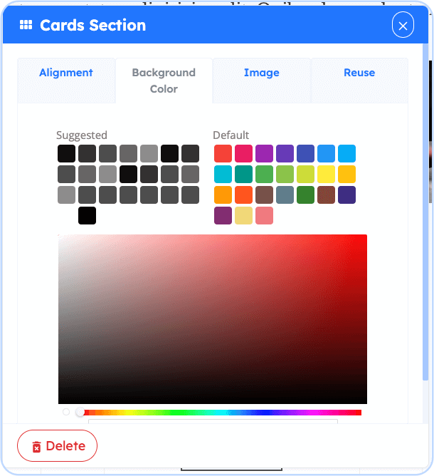
The Background Property simply controls the background color of the Banner.
Image
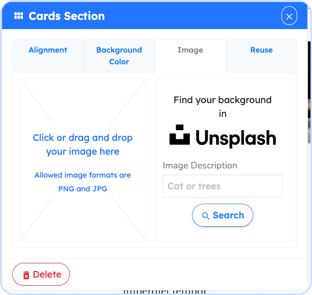
The Image Property of the Cars Section Element controls the background image of the element. You can upload your own image or choose an image from Unsplash using the search image functionality. There is also the option to move and position the image, as well as zooming in or zooming out of it.
Reuse
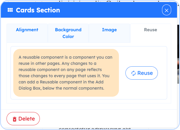
The Reuse property enables this specific Cards Section to be reused on other pages and having to not redo the design and future changes you apply to it.